Showing posts with label G324 Planning Print Productions. Show all posts

Sunday, 3 April 2011

Monday, 21 March 2011

Researching other adverts to get ideas for my own advert


This is a spread from NME of 3 artists (The Wombats, The Specials and Brother). As a whole I like Brother advert the most because of the font which really catches my eye because it's interesting in the way that it curls at the end. I think Brother advert seems relaxed and I like the use of the photo of the band because then their audience are introduced to them. I think their advert is effective yet simple at the same time which I really like and is similar to how my artist would be selling themselves to their audience.


Esben and the Witch advert is really eye catching in the way it has used an image which isn't of the artist. I think this is effective because it's creative and links to my target audience's creativity.


The aspect of this advert is the font, which is the only part I can really connect to my target audience. The font is very twirly and bold, and I think it's artsy and my target audience would be drawn in by this aspect.


Again like Beady Eye it's the font of the advert which really catches my eye in thinking that it would attract my target audience. I like the artsy way that the font overlaps and piles on top of each letter and I think this is a really interesting way to grab an audiences eye.


This advert is from Q magazine and I think it's my favourite in thinking about my target audience. I like the use of the illustrated birds and how they vary in size which makes them more visually interesting. I like the white background around the birds which doesn't make the advert overly complicated, and the birds are more effective visually. The birds add that creative/artsy edge which our target audience is drawn too.

Wednesday, 16 March 2011

Advert


I wanted the advert to link in with the album cover so I kept with the same use of yellow behind the font with the added noise for the texture of the beach to link with the music video, and to add an aged effect to the print productions to link to our audience's interest in vintage. I wanted the advert to just be a continuation of the album cover so when audiences saw the advert, they would then recognize the album and be more inclined to watch the music video to see if the music video is similar to the print productions. Like the album cover, I wanted the advert to also link in with the music video which is why I placed a photo of the artist behind the font looking thoughtful and it seems like she is reminiscing to get the sense of a broken up relationship/romance/melancholy. The reason I have placed the font across the artist is because I want the information to stand out and be rememerable to the target audience. The reason my artist is behind the font, also, is because I don't want the artist to stand out so much and be more of a mystery/more private to the audience so the audience will be more interested in researching the artist to find out who she is. The whole advert is aiming towards my target audience (females of a 16-24 age group) because of the feminine font and how it flows together, and the way the artist is in a yellow kind of glow which appeals more to a female audience. I like how the artist's hair is blowing in the advert which again hints at the themes of the music video (melnacholy/break-up of a relationship/reminiscent of the past) therefore aiming at the target audience.

I have chosen the advert to be half of an A4 magazine because I think this artist and it's target audience would prefer an advert which wasn't too 'in your face' but the advert needs to be remembered. Because of the artist's quality and how the target audience' s other favourite artists are quite private and shy (such as Laura Marling) I think the advert needs to be an A4 because the artist needs to be seen by the audiences but not come across as overly confident.
I think the whole advert appeals to the target audience because of the vintage quality of the advert (the noise added to the yellow background) and the use of the flowing font also seems quite artsy. The feel of the advert (mostly in the picture of the artist) connotes the feelings of the music video such as a break-up which makes audiences interested in the rest of the music this artist may have to offer.

Tuesday, 15 March 2011

Album Cover

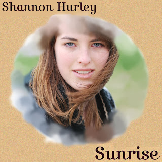
I wanted to create an album similar to Arctic Monkeys Humbug album because of how Humbug replicates an old LP jacket. Because our target audience wears vintage clothing and as an audience they are quite creative and artsy so using an old LP style reflects their interests and styles. I have chosen the same yellow colour as the Humbug album because it reflects the vinatage, washed out feeling, but then I added noise on the album sides to add texture. The noise also reflects the setting of the music video (the yellow grain reminds me of the sand) and I like how the album cover ties in with the video therefore appealing to our target audience.


This part of the album is where you would open the CD and in the style of an LP it would be the inside of the album jacket. The CD would slide into the sides of the album, along with the album booklet with lyrics. With the image I wanted to choose one which was different from the album cover because the one on the album cover is direct, and is telling audiences that this is the artist. With the picture on the inside I wanted it to be more wistful, and romantic so the fact that she is looking away and looking at something else gives a sense of her reminiscing and reflects the attitudes of the actors in the video. I used a brush to go around the edges of the photo to create that same wave/dashed sand look because I wanted it to link back to the beach and the melancholy/romance of the beach.


I have used the same noise effect to create the feeling of sand to link to the front of the album, but I didn't want the back too fussy. There is a lot happening on the front of the cover that I wanted the back more simple, and I think the font decorates the album well enough. The font is quite feminine in the way that it curls at the end of the letters and the way it joins up. The target audience is quite a feminine/artsy audience so the font appeals to them because the font is decorative but is gentle and feminine.


With the album cover I created a new file on photoshop and began with the basic yellow (similar to Arctic Monkeys - Humbug) and then thought of adding noise because I think the noise is artsy/creative, adds a vintage quality, and the same sand/beach link from the video which all appeals to my target audience. I then selected the photo of the artist featured in the music video (using a circle select tool) and copied this image onto the cover. I selected a paint brush which when you painted with it it reflected the waves which links into the video. The paint brush makes it look more arty as well which appeals to the target audience. The font is artsy and feminine which again appeals to the audience I am targeting. I didn't want the font to overpowering and I think the font is simple, elegant and the reasons I said above - the font is simple, and make sures that the album isn't in your face. I chose the photo because it's very natural, and I like how it's posed but still using a natural background so to the audience it looks friendly, slightly formal, and the audience is introduced to the artist.

The spine reflects everything I have already said, and I have taken keys elements from the cover for the spine so when it's on the shelf the audiences can see the sand texture of the noise and the feminine font which all link to creativity.