Damien Rice - The Blower's Daughter show's a beach location being used as a place of reflection and melancholy. Damien Rice's music video is actually a music video for the movie Closer, but it has a narrative inbetween the movie clips. The narrative is a couple wanting each other, which links to my own music video themes. Damien Rice's video is set in winter similar to when my own music video will be filmed, but winter also links to sadness and things no longer growing which represents the relationship in my music video not growing, and being sad and cold between the couple.
Friday, 8 April 2011

Sunday, 3 April 2011
What have you learnt from your audience feedback?
1. What do you like on the whole about the music video?
2. What genre would you link with this music video?
3. What do you think about the actors? Do they fit the roles? Can you relate to them?
4. What part of the video grabbed your attention the most?
5. What did you dislike about the music video?
6. What other music have you heard which links to this music video?
My target audience is young females, and possible males who are of folk-pop genre, who listen to music such as Ellie Goulding and Laura Marling, while shopping at Topshop and vintage boutiques. My target audience are quite quirky and different, and enjoy listening to new music to add to their favourites which is why I think they will respond to Shannon Hurley, and have asked these questions to make sure I have achieved everything they have wanted from a music video.
I gave my questionnaire out to people aged 16-24, mainly females because of the feminine qualities surrounding the music video, but also a few males to get their opinion and hear their thoughts on the male actor in the music video and how they respond to him. I used facebook (a social networking website) to hand out questions to people who I believe fit my target audience, and I also handed out questionnaires at sixth form to hear their response about the music video.
The answers I received were very useful. For the first question a lot of people replied with, 'the relationship of the two actors is very effective', 'the relationship and how you have captured all the relationship qualities really helps me respond to the actors', 'I really enjoy the aesthetics of the music video'. The last quote about the aesthetics of the music video really helped me realize that the music video had captured that folk-pop feel of the music video, which is really important because the music video is targeting the right audience through the feeling of the music video.
For the second question the responses were quite varied, 'The song links to the acoustic genre.. the split screen is so creative that makes me think folk', which is what I was aiming at because the song is acoustic, but it has the elements of the folk genre. I want my audiences to think about all these qualities when they are watching the video.
For the third question my most helpful answer, and the one which made me feel confident and helped me realize that I had achieved something which worried me was, 'The actors are really realistic which makes me relate to them'. I was worried in the beginning about the cast of the music video because they were quite unconventional and not like actors in other music videos. I wanted the female character to have that beauty aspect around her, but I also wanted audiences to recognize something in her which they see in their friends which makes the music video something audiences can relate too.
The fourth question was about which part of the music video grabbed your attention and the answers varied from, 'the train station shots' too 'the shots of the live performance and the use of one space.', which shows how the location reaches out to different audience members of the folk genre. I am glad that the audience likes the one location because that shows that the folk aspect of privacy, cosiness and friendliness have come through in the video and have helped the audience relate to the surroundings of the artist.
The fifth question asked the audience what part of the music video they disliked and the helpful answer which really made me think was, 'At the start instead of going straight into the artist playing, introduce your characters to the audience further.'. This answer is really helpful, and had made me think that if I could re-do the music video I would carry on with the characters much further to introduce them and introduce the atmosphere of the video in more depth.
In the sixth question a lot of people answered with Laura Marling and Ellie Goudling which is really good because then the genre of folk-pop has really shown through the video. We wanted the creative flair of Laura Marling's videos but the music is similar to Ellie Goulding and Kate Voegele we wanted aspects of them in the music video also.
Hearing audience feedback has made me feel more confident about the music video, and has helped me understand further how I have achieved to target my audience.
In what ways does your media product use, develop or challenge forms and conventions of real media products?
By researching other music videos and media theorists such as Goodwin I was able develop conventions of real media products, and use them to my advantage.
Goodwin's theory consists of eight aspects; how the music video has links between the lyrics and the visuals, intertexual references, music videos demonstrate genre characteristics, representation of the artist in the music video and a performance based/narrative based music videos. My music video ties in with a lot of Goodwin's theories and by researching him I was able to use real media conventions in my music video.
The links in the music video to the lyrics is why we chose a relationship breaking down, 'I want to touch you', 'I want to see you', and 'I want to make you see That yesterday was long ago', are all the lyrics which are constantly being repeated through the whole song so that's why we decided on a relationship falling apart. The lyrics 'I want to see you', also links in with the music video because the couple are on the train getting ready to meet each other again which shows that the couple want to see each other again. Music videos constantly reference the lyrics in their visuals like Daniel Powter - Bad Day music video where the lyrics 'Cos you had a bad day' is constantly referenced in the actors facial expressions and how the actors continue out their days in a bad rut. Goodwin's theory of the lyrics linking to the music video has helped me develop real media conventions.
Another theory of Goodwin's is intertexual references which is why I began researching music videos. I initially researched videos before I had any ideas and before I had a song to get inspired, and realize what music I wanted. From this research, I found my song and then began to research videos which inspired me for the concepts for the music video. Daniel Powter - Bad Day is a heavy influence on the whole music video because of the combination of live performance and a narrative story told through split screens. The initial idea of split screens came from the movie 500 Days of Summer and how they tell a relationship through these split screens, but after I had further researched split screen music videos I liked Daniel Powter's video the most. From Daniel Powter's video led me onto research Plain White T's - Hey There Delilah and then get the idea of featuring small aspects of the location around the music video. My music video is heavily influenced by other media products therefore following the conventions of real media products, and my music video has loads of intertexual links to other music videos.
Goodwin's theory also suggests that the music video should have the genre's characteristics through the music video. The folk-pop genre of my target audience is shown through the idea of a broken up relationship because this targets the audience of females at the age of 16-24. The idea of split screens links to the creativity of the genre which is folk, so the music video has to have a 'quirky' and strange quality to it to recognize the genre of artsy folk.
As a production group we wanted to add a live performance because of the research into Daniel Powter - Bad Day music video. I thought the live performance was a good way of portraying the artist to the audience and also portraying the audience through the artist. Several music videos portray their audience through their live performances like rock music videos will use live performances their 'punk' audience will be shown in the video. I researched other live performances which link to my target audience such as Laura Marling - Damage Done, who links to the folk audience, and Marina and the Diamonds - Hollywood acoustic, which also links to the pop audience. From these videos I wanted to incorporate live performance with the narrative so I could portray my audience. I have done this by using a singular room which makes the performance more intimate, private and relaxed which links to the folk target audience. Adding a live performance uses the theory of Goodwin but I didn't have Goodwin in mind when I researched live performances. Live performances use media conventions to portray the audience, and to portray the artist to potential audiences.
The idea of using a narrative for the music video links to other music videos therefore the use of media conventions. The narrative also doesn't follow a linear structure therefore also following media conventions of a music video because music videos don't have to have a beginning, middle or end, so I have featured in the music video a flashback to show audiences that the couple featured in the music video used to be in love.
The mise-en-scene throughout the music video are developments of conventions I have gained by researching other media products. For example, the split screens have been taken from 500 Days of Summer and Daniel Powter - Bad Day music video showing that split screens are a real media convention used to tell the narrative in different ways. I have used the split screens to show the divide between the two character's and how separate they are, similar to how the character's in Daniel Powter - Bad Day are presented. The use of a beach location links to media conventions because music videos such as Damien Rice - The Blower's Daughter uses a beach as a place of sadness and reflection over a relationship which I have taken into my own music video to reflect the melancholy of my music video.
I have been able to develop and use media conventions with the help of the theorist Goodwin, who's theories have taught me how to create a conventional music video. My music video doesn't challenge media conventions really, because all the qualities in my music video have featured conventional media conventions.
Wednesday, 30 March 2011
Researching live performances of other artists
As a production group we decided that we wanted to add a live performance and not only the narrative of our music video to tie in with other real media products.
I looked at these videos then sent them to the rest of my production group to analyse. From these videos I liked the use of the surroundings in the live performance and the interesting camera angles to make a live performance more interesting. I also like the use of one room and not a stage, it makes it seem more personal and cosy.
From these videos we were largely inspired to add our own live performance, and took elements from these videos to add to our own music video such as; the use of one room, filming elements of that one room, and filming the artist while she is not playing.
Sunday, 27 March 2011
{INITIAL RESEARCH} I'll Be Yours - Those Dancing Days Analysis
LYRICS;
I was always searching for the last dismissing
now that I found you, wishes do come true
Butterflies inside me, make us fly where we want
I'm holding on, I'll be holding on
I'll be yours and you're mine, and I'll be your friend, let's stay till the end,
I'll never stop loving you
I'll be yours and you're mine, I'll never let go, don't ever let go
I'll never stop loving you
Capture me in your arms, wrap your soul around me,
never felt so free, you're so close to me
Lie on the clouds and we're kissing the sky,
rain drops are falling but we're staying dry
And I'll be holding on, I'll be holding on
I'll be yours and you're mine, and I'll be your friend, let's stay till the end,
I'll never stop loving you
I'll be yours and you're mine, I'll never let go, don't ever let go
I'll never stop loving you
I'll be yours and you're mine, and I'll be your friend, let's stay till the end,
I'll never stop loving you
I'll be yours and you're mine, I'll never let go, don't ever let go
I'll never stop loving you
I'll be yours and you're mine, I'll never let go, don't ever let go
I'll never stop loving you.
Who is the band and what kind of genre is the music?
The band consists of five girls from Stockholm, and they are compared to 1960s girl groups and compared to Northern Soul. They formed in 2005 while they were still all in school. They are signed to Wichita Recordings and are an indie pop band.
What music video conventions have been used?
Their music video doesn't follow an ordered narrative (non-linear narrative) or a real storyline which is typical of a music video because music videos don't have too. A music video can just capture a feeling of the song or the lyrics of the song to create a music video and just portray themselves through live performances etc which Those Dancing Days has done in their music video. The music video also features a live performance which is a recurring music video convention because this allows audiences viewing the music video to see the bands usual audience/fans, and also get a sense of the band and what they are about. Live performances introduce the band to potential audiences and also setting up a relationship with their existing audience.
How do they link to the lyrics? What do they connote?
I'll be yours and you're mine, and I'll be your friend, let's stay till the end,
I'll never stop loving you
I think these lyrics link to the video the most because the video is very fun, and about friendships and relationships which links to the top lines of the lyrics. The music video is a repetition of the same recurring theme of friendships and relationships with people which keeps audiences reminded of the lyric 'I'll be your friend' etc. There are several long shots of people running around and laughing and participating in friendship activities which emphasizes that cheerful/friendly quality of the lyrics and how friendships should last 'till the end'. To contribute to that friendly atmosphere there are a few close ups of smiles and laughs which keeps up that same repetition. The whole video seems to be concentrated on the people in your life and how they make it fun, and the music video connotes all of this.
How is the audience represented?
The audience is represented through the artist's style and genre. The target audience seems to be indie teenagers which is represented through the artists choice in clothes and other aspects of their lifestyle. The artists wear clothes like large jumpers, long hair with square fringes, vintage clothing, shorts and tights etc which links to their audience who probably wear similar clothing. The audience is featured in the music video by the artists doing live performances and the music video showing other people who look similar to the artist and not just in their clothes but their happy atmosphere and their 'living life to the fullest' attitude.
What is the relationship between artist and audience?
The artist is featured playing in small venues such as bars, basements, backrooms etc which makes the relationship between artist and audience seem personal and the band seem to have a small following which again makes the relationship seem personal especially in their audience space.
How is the video appealing to target audience?
Their target audience has featured in their music video and from this it makes it easier to see how the music video appeals to the artists target audience. The music video is visually creative and artsy in the way that the shots are quite bleached out, and how they have used focal points to create moments of blur and sharpened moments. The video had been edited fast paced which appeals to the fun and party side of the target audience which is featured in the bands video.
Screenshot of music video

This screenshot shows the happy and playful theme which echoes all through the music video. This mid shot shows smiles, and the girl dancing through happiness with a friend which connotes the lyrics of the song.

This long shot just reinforces the friendship which runs through the music video and the union of people. The girl represents her audience's sense of style; hairbuns, cardigans and tights etc = indie audience.

This long shot of the band shows all members and they represent their audience. They appeal to a more female audience because they are an all girl group and their lyrics are romantic and sometimes melancholic which appeals to more of a feminine audience. Their sense of style echoes their audiences; quirky sense of style, creams, chiffons.

This long shot actually moves into a close up of the friends smiling which shows what I have mentioned before (plenty of close ups of smiles). Friendship is just reinforced here in an activity which is fun and silly.

In this long shot showing the bands dressing room and most of the band getting ready two of the band members high five which shows unity and support from friends and how friends cheer each other on. The high five is friendly.

I have chosen to show this shot because of the band members fringe because her sense of style is probably the same as her target audience. (Indie audience)


All of these shots just act as evidence to everything I have already said; the bands sense of style representing their target audience to audiences, their friendship activities, their unity, and the silly activities they get involved in which makes their audience want to do the same.


These shots are all different live performances of the band on tour which shows the audience their dedication to their music by showing how much they perform. The whole music video is like a video diary which really connects the band members and audiences because the band have set up a personal relationship with the audience. The band is letting the audience into their lives which makes the band seem open, friendly, and happy which is all shown in the video.

HAPPY, FRIENDSHIP, UNITY, LAUGHS, STYLE. AUDIENCE REPRESENTED THROUGH THEM.

The above shot is of the band's audience watching them live and because this is shown in the music video the band is showing other audiences the importance of their fans and how they think they are important enough to be featured in their music video.


The rest of the shots just show everything I have already mentioned which the music video continuously repeats throughout. Friendship being important, constantly having a laugh, the band's dedication to their music and how much they enjoy what they do, the importance of their fans and audience, and a lot of love and fun.
How did you use new media technologies in the construction and research, planning and evaluation stages?
How did you use new media technologies in the construction and research, planning and evaluation stages?
At the start of the whole production me and my production group began to research initial ideas from all medias. For example we used the internet to look at pictures and print them to contribute to a visual concept mood board so we could gain ideas and a sense of what visual style we were trying to achieve. From the song which we found on the internet we got a sense of our audience. We researched several tribes using FindYourTribe.com and understanding different tribes, and from this we got a sense of our own audience. The song is folk-pop similar to Ellie Goulding or Kate Voegele so our audience has elements of folk, and pop. Our concept board had images of the beach because we originally decided on a beach location, and our concept board featured a couple which aimed to a female audience of 16-24 in age. From this we began to brainstorm together by watching movies such as 500 Days of Summer and without the use of new media technologies we wouldn't have got the basis of our idea which was split screens and the sense of a relationship breaking up and the emotional difficulties tied to this experience. From this we used the internet and websites such as youtube and vimeo to study videos like Daniel Powter - Bad Day and Jean-Sebastien Monzani - Your Secret to get the ideas about using notes to explain the narrative and further research into split screens. From using the internet to study Monzani's video we were able to link his video to Death Cab For Cutie - Grapevine Fires therefore using the internet to explore this video further and taking ideas from this video also. One of my initial ideas was to use a scrapbook to tell the narrative which came from the Grapevine Fires video so without the help of youtube this idea wouldn't have let me developed into another idea. Going back to 500 Days of Summer as a production team we watched the movie on television and the idea of setting the music video on a train came from this movie so new technologies have helped a lot in developing ideas and coming up with the initial ideas. 500 Days of Summer use the train for the couple in the movie to meet again, so I took this idea and used the train as a somewhat metaphor the couple moving through their relationship hence the flashback to their past. The flashback also links to the 500 Days of Summer movie because of the way the narrative jumps through the relationship so I took this idea as well. Using the internet we explored other music videos such as Plain White T's - Hey There Delilah where we decided that we liked the use of the split screens being a variety of different shaped boxes instead of just a split so we could then show audiences different aspects of the location (the beach, the waves, other people surrounding the area, etc...). Another music video which I really liked and would loved to have responded to further was Cheryl Cole - 3 Words because her music video has split screens but they come together so I used this idea for the end of the music video where the couple meet and the split screen comes together to show the couple have joined together once again. We took a lot of elements from music videos and movies that we had watched either on the internet or using some other technology so our ideas wouldn't have really developed if we hadn't have used these new technologies to help us.
To plan our music video we used the internet to search for props and costumes to get a slight idea of how we wanted our cast to visually look to the audience. We searched costumes through google and then posted them on our blogs to create a slight visual mood board of our character's costumes. We also used the internet to plan our props: a mobile, a watch, cereal etc to visually explain our ideas and show what we were thinking and make sense of our ideas. While planning I sketched a mood board to show our step by step shots visually, and trying to gain a sense of what our music video would look like essentially. After sketching the mood board I had to scan the mood board onto my blog, which meant that without technology we wouldn't be able to experience what the music video would essentially look like. During planning I also took location shots of Sheringham with my Nikon D60 and used my laptop to upload the photo's onto blogger. Photographs of our location really helped to visualize where the narrative would take place, and help people viewing my blog what my visual processes were which the photographs contributed too. My blogger has also helped me to plan the music video because it has brought all of my ideas into one place so I can keep referring back to it to help develop ideas, and see how my ideas go together and if my visual ideas go together or if they clash. My blog has helped me to keep my ideas in one place, and help me remember what ideas I have had while new ideas are being developed.
When it came to the editing process of the music video we used Adobe Premiere Elements to edit all of our music video together. It took us a long time because we wanted to use split screens so we had to take each shot and place them on new tracks on Adobe to edit them together. We changed the sizes of the video clips using Advanced Editing by either cropping, or just adjusting the sizes of the clips. When we added our live performance we laid down the music track on the audio, and the whole shooting of the live performance and made sure they matched up, then we hid certain parts of the video by using the razor tool too cut the video up and dragging the visible line down so it was no longer there. We used transitions on Adobe to move smoother from some of the shots so the audiences eyes can adjust to the new shot appearing on the music video. Adobe Premiere helped pull the music video together and bring out the themes of a relationship being broken up.
For the evaluation I have used a social networking site (facebook) to ask my target audience (friends of mine who are apart of my target audience) what they think of the music video and what is visually interesting, if it appeals to them, and what they enjoy most about the music video along with other questions. Facebook has helped me find out what my target audience really thinks of a music video we have created with them in mind all the time.
Monday, 21 March 2011
How effective is the combination of your main product with ancillary texts?
The music video (main production) and the print productions (ancillary texts) create a good combination because they both target the same audience through having links to the music video. The target audience is of folk/pop genre and there are several links to them in the music video so I wanted the same effect on the print productions. The ancillary texts sells the main product to the target audience and my ancillary texts give the audience a hint at what is in the music video by repeating similar themes which are repeated in the music video. While creating my advert and album cover I made a few direct links to the music videos so the target audience would feel more inclined to watch the video. By having these links the target audience will be drawn in by the ancillary texts and when they watch the music video they will see these links being repeated there as well.
From the album cover the audience is able to gain a sense of the artist’s style and a hint at what the music video is going to be like. From the advert target audiences can get a sense of the type of music Shannon Hurley will play because the target audience will link the advert and album to other artists with similar styles; Laura Marling, Kate Voegele, Ellie Goulding ecterera.
When it came to editing the album cover I wanted to have similar links to other artists to promote Shannon Hurley to the target audience because the audience will recognize these links and be more inclined to listen to her music. With the album cover I used a paintbrush to create the sense of water to link to the waves that are included in the music video, and the golden background which I have added a photoshop technique too called noise is linking to the sand of the beach. I want the album cover to represent the music video so the techniques I have used on photoshop for the album cover are reflecting the melancholy and romance of the beach. The noise I have used on the background also targets the folk audience because it’s different, creative and has a vintage quality which links to the audience’s interest vintage aspects. The vintage quality was how I linked the album cover to Arctic Monkeys - Humbug because I want that same quality they have with their album. The photo featured on the album cover is showing audiences and these potential buyers of the album who the artist is and gives the album a friendly quality because the artist is portraying themselves to an audience and not remaining private. The photo I took links to the artists who I studied like Kate Voegele and Ellie Goulding who portray themselves on their albums so I wanted this quality so then my album cover was a mix of qualities I have learnt from different albums and targeting my audience. The photo I have chosen for the album cover is linking in with the music video, which I took at the beach, because of the way the wind is blowing the artist’s hair and the natural background all links with the romantic and melancholy themes of the music video. The album cover is giving the audience an idea of what the music video will be like and an insight into the artist’s style of music. The album cover ties in with other albums with the same target audience that I have so this audience will see that Shannon Hurley's music is their kind of music and will be more interested in listening. The album cover shows what age group and gender (females, 16-24), the whole production is aiming at because the female artist is looking natural and feminine, the light colours, the womanly font and the same themes I have already mentioned which the album connotes. The artist on the cover of the album is of the same age as the target audience which helps the audience relate to the artist and makes them feel more connected with her. With the album cover I did want to include aspects of Laura Marling’s album cover because the target audience for Laura Marling is the target audience for my music video so by including these aspects (such as the creative elements) this is showing the target audience that they should buy the album. The creative aspects which Laura Marling's album has inspired me to include is the paintbrush around the photo of the artist because it creates a 'wave/sea' quality without using a photo of the sea.
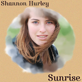 (Final Product)
The advert has all the same themes that the album cover has. The advert has carried on with the same golden background with the sand texture, and the use of the feminine font and the background of the advert is a photo of the artist. The photo of the artist I have decided to feature is similar to the album cover’s because you can see that the wind is blowing the artists hair which links to the melancholic feeling of the music video, but I like how the artist is looking away which gives the target audience the sense of a break-up in a relationship because the artist is looking thoughtful like she is reminiscing. The other reason I have included a photo of the artist looking away is so the target audience feel interested in who she is and wanting to know more about her so they feel more inclined to research her. The advert and the CD cover work together to sell the artist to the target audience therefore the target audience will watch the music video and listen to the music of the artist. I have used the same font because I want the advert to be an extension of the album cover by carrying on the same decorative themes to target the target audience. I want the target audience to see these recurring themes and then recognize the album in the shops and the ancillary texts will become fixed in the target audiences mind. With the same recurring themes the audience will constantly get these visual repetitions everywhere they go and know they are linked so they will remember to research the artist. I have spread the font across the photo of the artist and the advert because I wanted it to be eye-catching, bold and the information on the advert is more important than the artist’s image. I wanted the font to be eye-catching so that the target audience would remember her name and then see the artist’s album so they would be more interested in purchasing the album. From purchasing the album the target audience will see who the artist is because the album features the artists full face, so the advert is luring the target audience into viewing the album therefore going on to see the music video.
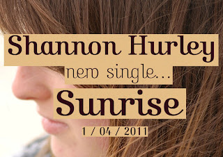 (Final Product of Advert)
In conclusion the album cover and CD cover work together to target the folk audience’s to watch the music video. The ancillary texts all foreshadow what is to come in the music video, and because of the this audiences are more interested in watching the music video. The ancillary texts also make audiences want to watch the music video before purchasing the album, so if the ancillary texts sell the artist the audience will research them further. The advert also makes the artist seem like a mystery so the audience will want to know more about the artist therefore watch the music video then lead them to buying the album.
Researching other adverts to get ideas for my own advert

This is a spread from NME of 3 artists (The Wombats, The Specials and Brother). As a whole I like Brother advert the most because of the font which really catches my eye because it's interesting in the way that it curls at the end. I think Brother advert seems relaxed and I like the use of the photo of the band because then their audience are introduced to them. I think their advert is effective yet simple at the same time which I really like and is similar to how my artist would be selling themselves to their audience.

Esben and the Witch advert is really eye catching in the way it has used an image which isn't of the artist. I think this is effective because it's creative and links to my target audience's creativity.

The aspect of this advert is the font, which is the only part I can really connect to my target audience. The font is very twirly and bold, and I think it's artsy and my target audience would be drawn in by this aspect.

Again like Beady Eye it's the font of the advert which really catches my eye in thinking that it would attract my target audience. I like the artsy way that the font overlaps and piles on top of each letter and I think this is a really interesting way to grab an audiences eye.

This advert is from Q magazine and I think it's my favourite in thinking about my target audience. I like the use of the illustrated birds and how they vary in size which makes them more visually interesting. I like the white background around the birds which doesn't make the advert overly complicated, and the birds are more effective visually. The birds add that creative/artsy edge which our target audience is drawn too.
Wednesday, 16 March 2011
Advert

I wanted the advert to link in with the album cover so I kept with the same use of yellow behind the font with the added noise for the texture of the beach to link with the music video, and to add an aged effect to the print productions to link to our audience's interest in vintage. I wanted the advert to just be a continuation of the album cover so when audiences saw the advert, they would then recognize the album and be more inclined to watch the music video to see if the music video is similar to the print productions. Like the album cover, I wanted the advert to also link in with the music video which is why I placed a photo of the artist behind the font looking thoughtful and it seems like she is reminiscing to get the sense of a broken up relationship/romance/melancholy. The reason I have placed the font across the artist is because I want the information to stand out and be rememerable to the target audience. The reason my artist is behind the font, also, is because I don't want the artist to stand out so much and be more of a mystery/more private to the audience so the audience will be more interested in researching the artist to find out who she is. The whole advert is aiming towards my target audience (females of a 16-24 age group) because of the feminine font and how it flows together, and the way the artist is in a yellow kind of glow which appeals more to a female audience. I like how the artist's hair is blowing in the advert which again hints at the themes of the music video (melnacholy/break-up of a relationship/reminiscent of the past) therefore aiming at the target audience.
I have chosen the advert to be half of an A4 magazine because I think this artist and it's target audience would prefer an advert which wasn't too 'in your face' but the advert needs to be remembered. Because of the artist's quality and how the target audience' s other favourite artists are quite private and shy (such as Laura Marling) I think the advert needs to be an A4 because the artist needs to be seen by the audiences but not come across as overly confident.
I think the whole advert appeals to the target audience because of the vintage quality of the advert (the noise added to the yellow background) and the use of the flowing font also seems quite artsy. The feel of the advert (mostly in the picture of the artist) connotes the feelings of the music video such as a break-up which makes audiences interested in the rest of the music this artist may have to offer.
Tuesday, 15 March 2011
Album Cover
I wanted to create an album similar to Arctic Monkeys Humbug album because of how Humbug replicates an old LP jacket. Because our target audience wears vintage clothing and as an audience they are quite creative and artsy so using an old LP style reflects their interests and styles. I have chosen the same yellow colour as the Humbug album because it reflects the vinatage, washed out feeling, but then I added noise on the album sides to add texture. The noise also reflects the setting of the music video (the yellow grain reminds me of the sand) and I like how the album cover ties in with the video therefore appealing to our target audience.
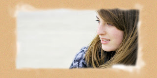
This part of the album is where you would open the CD and in the style of an LP it would be the inside of the album jacket. The CD would slide into the sides of the album, along with the album booklet with lyrics. With the image I wanted to choose one which was different from the album cover because the one on the album cover is direct, and is telling audiences that this is the artist. With the picture on the inside I wanted it to be more wistful, and romantic so the fact that she is looking away and looking at something else gives a sense of her reminiscing and reflects the attitudes of the actors in the video. I used a brush to go around the edges of the photo to create that same wave/dashed sand look because I wanted it to link back to the beach and the melancholy/romance of the beach.

I have used the same noise effect to create the feeling of sand to link to the front of the album, but I didn't want the back too fussy. There is a lot happening on the front of the cover that I wanted the back more simple, and I think the font decorates the album well enough. The font is quite feminine in the way that it curls at the end of the letters and the way it joins up. The target audience is quite a feminine/artsy audience so the font appeals to them because the font is decorative but is gentle and feminine.
With the album cover I created a new file on photoshop and began with the basic yellow (similar to Arctic Monkeys - Humbug) and then thought of adding noise because I think the noise is artsy/creative, adds a vintage quality, and the same sand/beach link from the video which all appeals to my target audience. I then selected the photo of the artist featured in the music video (using a circle select tool) and copied this image onto the cover. I selected a paint brush which when you painted with it it reflected the waves which links into the video. The paint brush makes it look more arty as well which appeals to the target audience. The font is artsy and feminine which again appeals to the audience I am targeting. I didn't want the font to overpowering and I think the font is simple, elegant and the reasons I said above - the font is simple, and make sures that the album isn't in your face. I chose the photo because it's very natural, and I like how it's posed but still using a natural background so to the audience it looks friendly, slightly formal, and the audience is introduced to the artist.

Monday, 1 November 2010
Our costume decisions
Boy: We asked the boy in our music video to wear clothes that he would wear everyday to make him look natural but also so audiences could relate to him through the clothes he wears. In the beginning of our music video we asked him to bring three different shirts to show new days but again asked him to choose his costume. With the flashback scene we asked him to wear a hoodie over his clothes to show that the couple have gone back to a time when they were together, but not happy. By putting the boy in a black hoodie it's made him seem 'bad' in someway, because in the music video we are going to have the girl arguing over something he has done so the black hoodie can in someways connote what he has done to upset her.
Girl: We asked the girl to wear light colours, and the girl in the music video is a friend of mine and I saw her one day in clothes that were perfect for the music video so I asked her to wear them. She is going to wear a white t-shirt with light coloured flowers on it with a light blue cardigan over the top with jeggings. In the video she will wear a purple jacket to show the girl is out and that her location is cold - by making the coat purple it links back into the girl's femininity opposed to the girl wearing a black coat. By making her wear light colours she seems more feminine, and more girls in our audience will relate to her. Linking back to our audience research the girl links to our female audience because of her light colours, but also her hair because it's long.
Girl: We asked the girl to wear light colours, and the girl in the music video is a friend of mine and I saw her one day in clothes that were perfect for the music video so I asked her to wear them. She is going to wear a white t-shirt with light coloured flowers on it with a light blue cardigan over the top with jeggings. In the video she will wear a purple jacket to show the girl is out and that her location is cold - by making the coat purple it links back into the girl's femininity opposed to the girl wearing a black coat. By making her wear light colours she seems more feminine, and more girls in our audience will relate to her. Linking back to our audience research the girl links to our female audience because of her light colours, but also her hair because it's long.
Friday, 22 October 2010
storyboard
 shot one: split screen of the girl's bedside clock, and the boy's watch. shot two: split screen of the girl in bed while the boy is eating breakfast (both are mid-shots) shot three: another split screen of the girl's bedside clock, and the boy's watch to show a new day. shot four: mid shot of girl in bed wearing different clothes to show that it is another day and the same for the boy who is eating breakfast.
 shot five: split screen of the clocks again to show time is continous and the couple have been broken up for a few days. shot six: the girl in bed wearing different clothes, and the boy eating breakfast in a different costume and both are mid shots. shot seven: split screen of the girl making her bed which will be a long shot, while the camera zooms on lyrics on the boys cereal. shot eight: split screen of a close up of lyrics on the girl's bed and a close up of the boy's cereal with the lyrics ruined by him throwing his spoon into his bowl.
 shot nine: the girl drawing her blind and letting the light shine into her room. (a shot we decided on after the storyboard was finished) tracking shot from behind of the girl walking to the bathroom and establish that she is in the bathroom. shot ten: close up of the lyrics stuck to bathroom tiles and then shower over them. shot eleven: three split screen of the girl applying mascara, blusher and her lipstick. shot twelve: close up of both of their feet as they enter the station.
 shot thirteen: split screen of the camera tracking the boy and the girl walking into the station and establishing that they are at the station. shot fourteen: split screen of a close up of the train station clock at different times to show that the couple are on different times. shot fifteen: a mid shot of the boy and the girl putting their ticket into the barrier and walking onto the platform. shot sixteen: split screen of the camera tracking the boy and the girl as they walk onto the platform and wait for the train.
 shot seventeen: mid shot of the boy on the train texting on his phone. shot eighteen: close up of the girl's phone showing she has one new message from the boy (the person he was texting on the train is the girl). shot nineteen: close up of the phone showing lyrics ('sunrise'). shot twenty: split screen of a mid shot of the boy and the girl travelling on the train both looking around them/out of the window/listening to music etc.
 shot twenty one: flashback of a series of photographs of the couple having an argument resulting in the girl slapping the boy and her walking away from him. 'Sunrise' will be written across the flashback because sunrise is the most important word of the song. shot twenty-two: mid shot of the boy getting up and leaving the train. shot twenty-three: tracking shot of the boy walking down the aisle of the train and then getting off the train. shot twenty-four: a mid shot from the sea of the boy walking towards the camera and to finish by him standing by the ocean and thinking. all through shot twenty-two to twenty-four it will be a split screen and the girl will be a continous shot of her still on the train to show that the boy gets to the beach before she does.
 shot twenty-five: mid shot of the boy standing at the beach looking out over the ocean looking thoughtful. shot twenty-six: close up of the boy's face and engaging the audience into his expression. shot twenty-five and twenty-six there will be a continous shot of the girl still on the train. shot twenty-seven: split screen of the boy sitting on the beach which will be a long shot and then a tracking shot of the girl getting off the train. shot twenty-eight: a tracking shot of the girl walking down Sheringham high street towards the beach.
 shot twenty-nine: a long shot of the boy and the girl finally meeting at the beach but not saying anything to each other but the two of them reflecting on the journey they just took and where their relationship still stands. The last shot will be the two of them looking at each other but not saying anything.
Tuesday, 19 October 2010
Cheryl Cole - 3 Words
Cheryl Cole - 3 Words (feat. will.i.am) from Burnocchio. Story. on Vimeo.
My production group has watched a few videos including split screens. We were impressed by the smooth split screens used in Cheryl Cole's 3 Words Video because they were smooth and came together and my production group have decided on trying to do a similar thing by making our split screens come together in the same way so they merge together by using two video cameras and placing them side by side so the split screens come into one shot.
Plain White T's - Hey There Delilah
hey there delilah from Jordan Lyles on Vimeo.
The above video is Plain White T's - Hey There Delilah which I remembered the other week so during editing my production group has decided that we will edit our music video similar to Hey There Delilah who use split screen in a modern way and the video is very interesting to watch.
Researching into our initial idea
In my production group we kept note of videos or movies or music videos over the summer that we would want to respond to and these videos have inspired us towards the making of our music video.
The clip above is from (500) Days of Summer directed by Marc Webb. My production group watched the whole movie and were inspired by certain parts like the part when the couple are on the train which we have based our whole music video around. Then the above clip shows where our split screen came from. In the movie Marc Webb shows Expectations and Reality of the main male character, Tom. In our music video we are using the split screen to show the male and female actor not expectations and reality but the actors will be on different times to show they are disjointed.
Your secret from Jean-Sebastien Monzani on Vimeo.
The above video is a short movie made by Jean-Sebastien Monzani that I found on a blog called See Hear Say. We have taken inspiration from this because he uses signs, captions, and cut out letters to push his video further and we have decided to use this technique but show lyrics on the pieces of paper and other ways to express the lyrics.
The above video is Daniel Powter's Bad Day music video which we watched after watching (500) Days of Summer to research further into split screens and it's uses. Daniel Powter's video has the characters on different times so they never bump into each other which is where we got the idea to leave our characters on different times. A few of our shots our similar to the Daniel Powter video because we start the video with the girl waking up the same way Daniel Powter's girl does and other shots are like Daniel Powter's.
Shot List
*SS; split screen. This shows the time difference between them and the fact that their lives are now separate.
Girl Boy
SS 1). Close up of alarm clock. Close up of his watch
SS 2). Long shot of her waking up. Mid shot eating his breakfast
SS 3). Close up of alarm clock. Close up of his watch
SS 4). Long shot of her waking up. Mid shot eating his breakfast
SS 5). Close up of alarm clock. Close up of watch
SS 6). Long shot, rolling out of bed. Mid shot eating breakfast
SS 7). Long shot of girls back, as she throws duvet up. Close up of cereal, with lyrics written on cereal.
SS 8). Zooms into the lyrics on the sheets. Mid shot of him throwing the spoon into the bowl disrupting the lyrics.
9). Long shot of her opening blind, revealing song lyrics on window.
10). Song lyrics stuck on shower wall, and spray water over lyrics.
SS 11). Close up of her eye, putting mascara on. (shot 11,12,13; split screen just the girl)
SS 12). Close up of cheek, putting blusher on.
SS 13). Close up of lips, putting lipstick on.
SS 14).Close up of feet walking into train st. Close up of feet walking into train station.
SS 15). Mid shot of back, showing train. Mid shot of back, showing trains.
SS 16). Mid shot showing train st clock. Mid shot if train st clock (different times)
SS 17).Close up of ticket + machine. Close up of ticket + machine.
SS 18). Tracking shot from behind; follow until sat down on the train. Tracking shot from behind;follow until sat down on the train.
19). Mid shot of him texting on his phone.
20). Close up of girl’s phone “1 new Message received”
21).Close up of her phone showing the text; song lyrics.
SS 22). Mid shot, looking out of train window. Mid shot, looking out of train window.
23). Flashback of images of the day they broke up. Flashback of the day they broke up. (sunrise written across the screen)
24). Mid shot, getting up.
25). Long shot, walking down the train; follow him off the train.
SS 26). Continuous shot, on the train. Close up of waves, zooms into him walking
towards us.
SS 27). Continuous shot, on train. Long shot, hands in his pockets looking out
at the ocean looking thoughtful.
SS 28). Continuous shot, on train. Close up of him looking over his shoulder,
and over his shoulder you see the rocks where they broke up.
SS 29). Follow her back as she gets off the train. Continuous shot of him leaving; includes,walking back up the beach, walking back up sheringham high street, getting on train.
SS 30). Tracking shot from behind as she Continuous shot (see shot 29)
walks along sheringham promenade, then continues the shot as she
descends onto the beach.
SS 31). Mid shot of her sitting by the sea, with her knees up, looking at a photo
of him.
SS 32).Close up of the photo.
SS 33). Long shot, getting up, holding photo to her chest.
SS 34). Long shot from behind, dropping photo into the sea.
SS 35). Close up of the photo in the sea.
SS 36). Long shot of her walking away. Last continuous shot of him.
37). Close up of lyrics in the sand, being washed away.
By Louise McGee + Laura Lewis. (Typed by Louise McGee)
Shooting Schedule
Date: 17/10/2010
Time: Meet at the train station at 10am and film for as long as we can at the train station and then get the 12:38 train to Sheringham.
Location: The train, the station, and Sheringham Beach.
Cast: Alex Poll and Rebecca Cooper.
Equipment Needed: Video camera, tripod, film camera (to take photos for the flashback), a digital camera (to take photos for the flashback incase the film photos don't come out very well)
Props: Mobile phones, train tickets.
Costumes: Each character will need to wear the same clothes they wear when they leave the house and they will both need to bring plain hoodies for the flashback scene.
What will happen: We will all meet at the train station at 10am and get the Sheringham train at 12:38 so we have enough time to shoot at the train station. We will film all the scenes at the train station, on the train and then the beach. We will have finished the majority of our filming on this day because the beach is the big part of our music video. We will take photos of our flashback scene as well.
Date: 24/10/2010
Time: 9am-11am
Location: My House (In Taverham)
Cast: Alex Poll, Rebecca Cooper
Equipment Needed: Video camera and tripod.
Props: Bowl, cereal, clock and all of the make up needed for the girl's scene where she applies make up. Also paper to write song lyrics on.
Costumes: The girl needs three different tops which resemble tops you would sleep in and the same outfit she wears to film at the beach. The boy needs to bring three different t-shirts and bring the same outfit he wore to the beach as well.
What will happen: We will all meet at my house between 9am until 11am and film all the house scenes with both cast members.
Costumes and Props
 Train ticket for the shot when the boy and the girl go through the barrier at the train station.
 Blusher for when the girl applies blusher in her bedroom.
 A mobile for the boy or girl to text from to each other.
 When the girl applies lipstick in her bedroom.
 Pyjama bottoms for the girl to wear when she is in bed.

Another mobile for the girl or boy to text from to each other. They will text lyrics to each other. 'Sunrise'.


Subscribe to:
Posts (Atom)